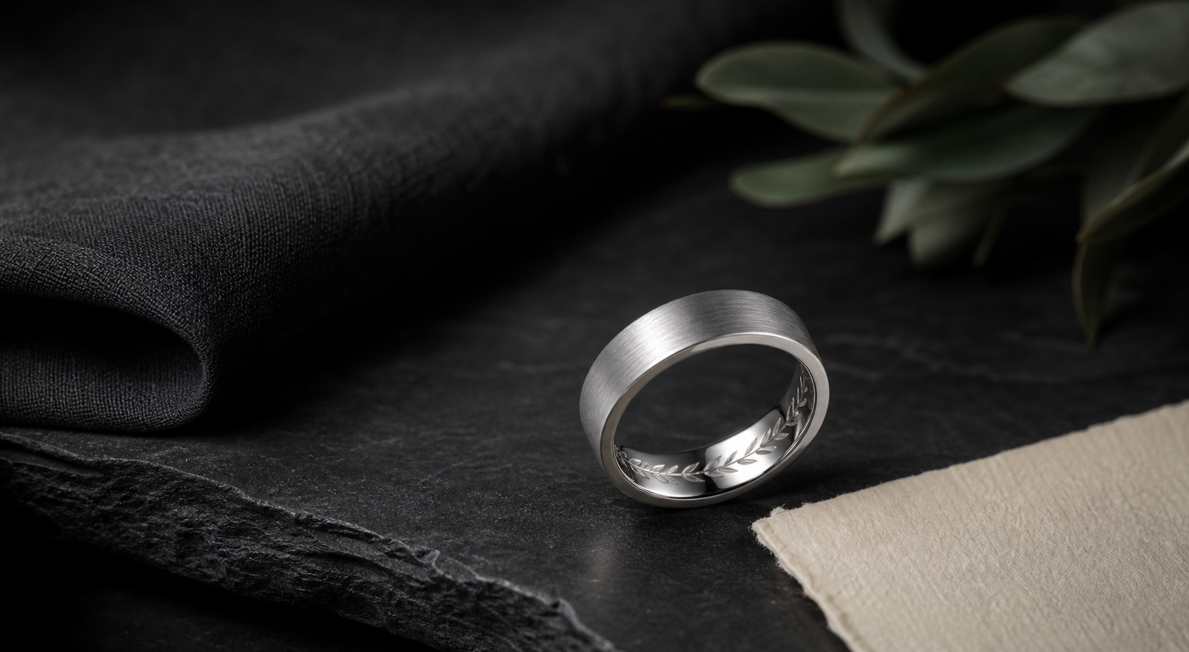


Most designs go wrong when buyers pick fonts and symbols before deciding on the material feel and the engraving contrast. Decide that first, then let it guide the rest.
Block initials, a wedding date, coordinates, a narrow outside groove, a fingerprint crop, or a short inside phrase are all fair game here. The mistake is fitting more than one onto a band that only has room for one clear idea.
inside placement is best for private words, while outside engraving should use bold spacing and simple geometry. That decision should come before font, symbol, or finish choices, not after.
tungsten-style bands feel heavier and harder-edged, so brushed surfaces and clean grooves usually look better than delicate script. Choose the finish based on how the ring will actually be worn, not just how it looks in a first mockup.
sturdy phrases such as "Built For Us," "Stand Firm," "Always Home," or a numeric date fit the material better than long cursive vows. A phrase that needs explaining probably belongs in the story note, not on the ring itself.
send clean print or handwriting files and expect them to be simplified for the hard, crisp look of the band. Prepare this before opening the designer so the session moves quickly.
use one visible mark and one inside detail so the tungsten band does not feel overworked. Everything on the band should point back to the same idea.
The most common issue is tiny script, low-contrast black-on-black marks, and crowded outside patterns can make a tungsten band look less premium. Catching it before ordering saves a redo later.
Decide this first: decide whether weight, scratch resistance, black finish, or silver restraint is the main reason for choosing tungsten. It is easier to add detail later than to remove it after the ring is ordered.
Bring it into the designer once ready: bring the material preference, band width, exact phrase, date, and any print file into the Friends of Irony designer.