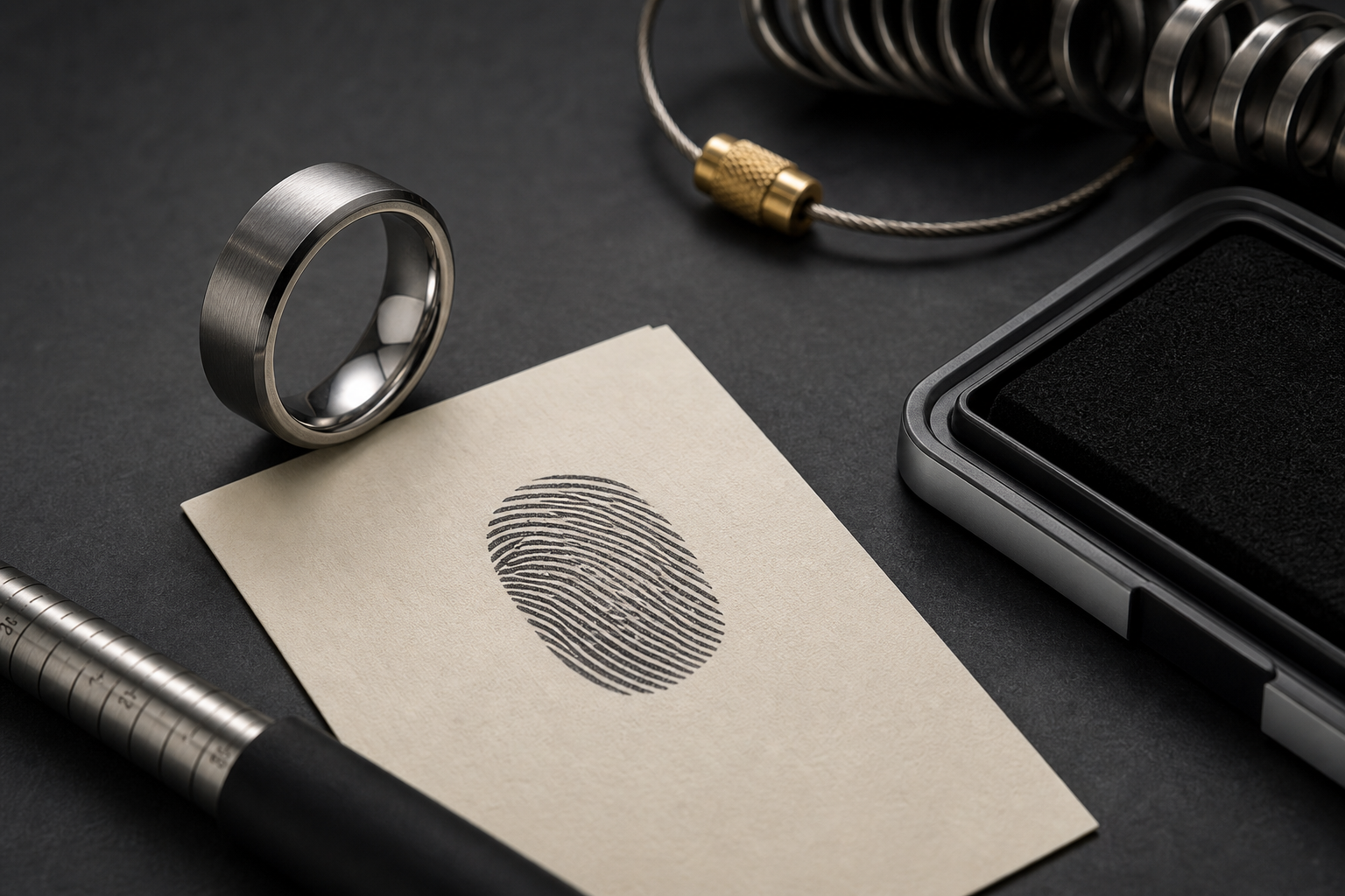


The strongest version of this ring comes from a real print set into a strong band with restrained details. Build the rest of the design around it, not alongside it.
A dark fingerprint panel, inside date, family initials, one-word phrase, or a print paired with a clean groove give you real options. Choose based on what the wearer will still recognize months from now, not what looks strongest in a first sketch.
outside placement works if the print is cropped boldly; inside placement is better for private family meaning. Keeping that split clear is what keeps the ring from feeling crowded.
brushed steel, black bands, and tungsten-style finishes can make the print feel less delicate. The finish should make the engraving easier to read, not just look premium in a photo.
short, direct words such as "Hold Fast," "Still Here," or initials work better than script-heavy phrases. Keep a shorter backup version ready in case the chosen band has limited engraving space.
send a high-contrast print image and note whether the ring is for a wedding, memorial, or family gift. Good source material is the difference between a crisp engraving and a muddy one.
balance the organic print texture with straight edges, grooves, or a simple band profile. Resist the urge to fit in every meaningful detail; pick the one that matters most.
Skip avoid tiny full-print ovals that look decorative instead of personal. What looks like more detail on paper usually looks like clutter on a ring.
The real decision is this: choose whether the ring should feel rugged, formal, memorial, or romantic. Once that is settled, the rest of the choices move quickly.
Once the details are gathered, open the Friends of Irony designer with the print, phrase, size, finish, and story note.